My “go to” website for technical analysis of precious metals, the US dollar & the US stock market is Rambus Chartology, where Rambus (that’s his handle – he’s the founding technical analyst) leads a discussion with extensive charts of what the markets are saying.
In January 2016, Rambus launched his quarterly Solari Report with a Blockbuster Chartology. You can find links to the entire series of quarterly and annual Blockbuster Chartologies at the end of this latest piece.
One of the reasons that Rambus is so good at his craft is that he focuses on “staying on the right side of the major trend.” The challenge of doing so at this time is that it is tempting to look for bottoms or to assume that the trend upwards in the US dollar or stock market may be over. However, Rambus consistently brings us back to the discipline of the Chartology. What does price tell us? As he describes so aptly, we are dealing with psychological warfare.
Sitting back once each quarter to get this perspective offers invaluable insight. So, here we go for the 1st Quarter 2021 Blockbuster Chartology!
Tonight I would like to focus on some long term charts for some of the US and world stock markets which are in the process of breaking out into new all time high territory after a several year correction in many cases. Keep in mind a correction or consolidation phase builds up the energy to launch the next impulse move. A lot of investors will see this sideways price action as a top that is sure to end the bull market especially if it has been in place for over ten years. The stock market just can’t keep going up because it has never happened like this before, they like to say, but that is exactly the right sentiment the bull market needs to see to keep going higher, the wall of worry.
My goal from a Chartology perspective is to show you the secular bull market from the 2009 crash low to the present and what lies ahead well into the future. I’ve mentioned many times in the past that this secular bull market is the most hated bull market in history which stems from the bear market low in 2009 which traumatized many investors. The emotional and psychological stress that investors felt is a hard thing to forget let alone see a future that has promise. They keep talking about the fundamentals and how bearish they are but refuse to look at the actual price action and what it is suggesting. When you boil everything away the only thing that really matters is the, “PRICE ACTION.”
The price action of a stock is not about opinions or fundamentals but what are real investors doing in real time with their capital. If more investors are buying then the stock price goes up and just the opposite when a stock goes down, more are selling. This is the cold hard fact, which most investors like to complicate by trying to understand what the fed is going to do, are interesting rates going up or down, what is the unemployment rate, the money supply and a 100 more fundamental reasons they have to figure out before they can even make a rational decision on what to do. And the thing is, even if they get it right they still don’t know how the stock or markets are going to react. How many times have you seen the markets go up on bad news or down on good news?
If there was ever an example why fundamentals don’t work, the rally out of the March 2020 crash low is a prime example. The economy couldn’t have been in worse shape with the highest unemployment rates in decades, businesses closing, states locked down and people dying by the thousands everyday which was happening all over the world. How much worse could it get?
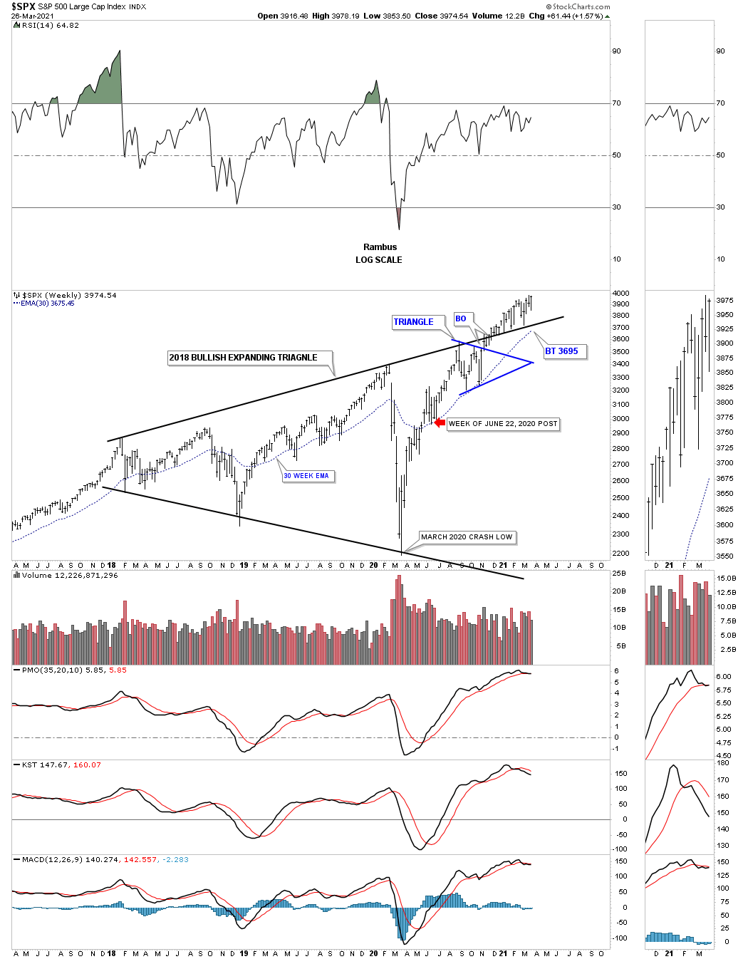
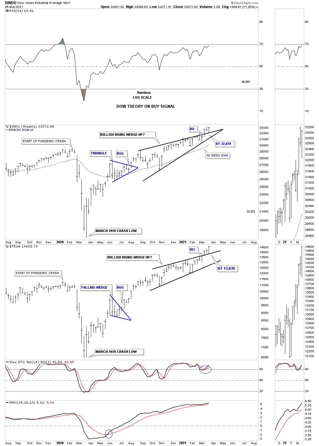
Let’s get started by reviewing the price action for the SPX which is a good proxy for the rest of the stock markets starting at the March 2020 pandemic crash low that happened one year ago this month. If one was locked in a room for the last year and didn’t know anything about the pandemic or all the negative fundamentals we hear about everyday and were shown this daily chart for the SPX they would have had a completely different view of the SPX. Yes they would see the crash low and probably wonder what happened but once they saw the double H&S bottom reversal pattern they would have assumed the worst was over as the SPX rallied strongly making a V shaped bottom.
The next bullish setup is one I’ve shown you many times in the past. When you see a small consolidation pattern form below the neckline and one above that is usually a very bullish setup which was the case here. The breakout from the small blue triangle that formed the backtest to the neckline produced the next impulse leg up which ended at the first reversal point in the August triangle. Since the SPX is in a bull market it stood to reason that the price action would eventually breakout topside of the August triangle which happened on November 9th with a breakout gap and backtest.
That impulse move lasted until the first reversal point in the February rising wedge formation which is consolidating that previous impulse leg. It has now been about 7 weeks or so of consolidation. The bears will look at the rising wedge as a bearish rising wedge while the Chartology is suggesting a breakout above the top rail would be very bullish for the SPX. Whenever you have a pattern that slopes up into an uptrend that tells you the stock or market is very strong as you get a correction in time but not price. The direction of the breakout is critical.
This is also called a running correction. Note the RSI at the very top of the chart. Most analysts would call the lower highs as a massive negative divergent because the SPX is rising while the RSI is declining. Again, with a bullish rising wedge this is what you expect to happen. Another way to look at what most will call a negative divergence is that while the RSI is much lower than the February high the SPX is close to making another new all time high. With the RSI at 59.09 it now has a lot of room to move higher along with the SPX before it gets overbought again.
The daily chart above shows you the last leg up in the secular bull market that began in March of 2009. We’ll put that rally in perspective using this long term weekly chart for the SPX. As you can see the March 2020 crash low was the last reversal point in the 2018 expanding triangle which is the dominate chart pattern in many of the different markets. An expanding triangle is usually considered a bearish pattern by many chartist which shows a market out of control by the ever widening swings. That could be true if the breakout is below the bottom rail but just like any other pattern, it is the direction of the breakout which is key.
Note the blue triangle that formed just below the top rail which strongly suggested that if the blue triangle experienced a breakout above its top rail that would ensure a breakout of the 2018 bullish expanding triangle. Notice how many times the top rail of the black expanding triangle has held support. Once an important trendline is broken it usually will reverse its role, in this case to support.
The red arrows shows the point when I did an end of the day “Market Update” where I began to see the possibility of something much bigger brewing. Keep in mind the 2018 expanding triangle wasn’t completed yet but what caught my attention was the reverse symmetry I was seeing. Many times in a hard move down you will see a similar move up over the same area because there were no consolidation patterns that formed on the way down so there is no resistance to stop the reverse move up.
This is what I wrote on March 22, 2020:
Before we look at today’s charts I would like to give you a short answer on why I’m taking on so many positions in the stock markets. The short answer for now is that I recently had an epiphany moment similar to the one I had on the US dollar back in 2014 when I discovered that massive 11 year base that was a fractal to the one that formed previously that most of you have seen many times.
Currently I’m seeing some patterns setting up in the stock markets that could lead to a very powerful rally the likes of which we’ve never seen before. I realize that many think I’m living in fantasyland by being bullish on the stock markets at this time which is fine because I don’t want to run with the herd. I want to go where no man has gone before.
The bottom line is that I need to see a little more price action which could happen fairly quickly over the next couple of weeks to come forward with I think could happen. The kicker is that the PM stocks will go along for the ride. I’m posting this today so I’ll be on record if indeed what I’m seeing plays out. It will mean nothing after the fact.
Current price action:
The red arrow shows the proceeding 9 month rally with last weeks price action closing at a new all time weekly closing high and could very well be ready to launch the next impulse move higher as most of the work appears to be finished with the breaking out and backtesting process.
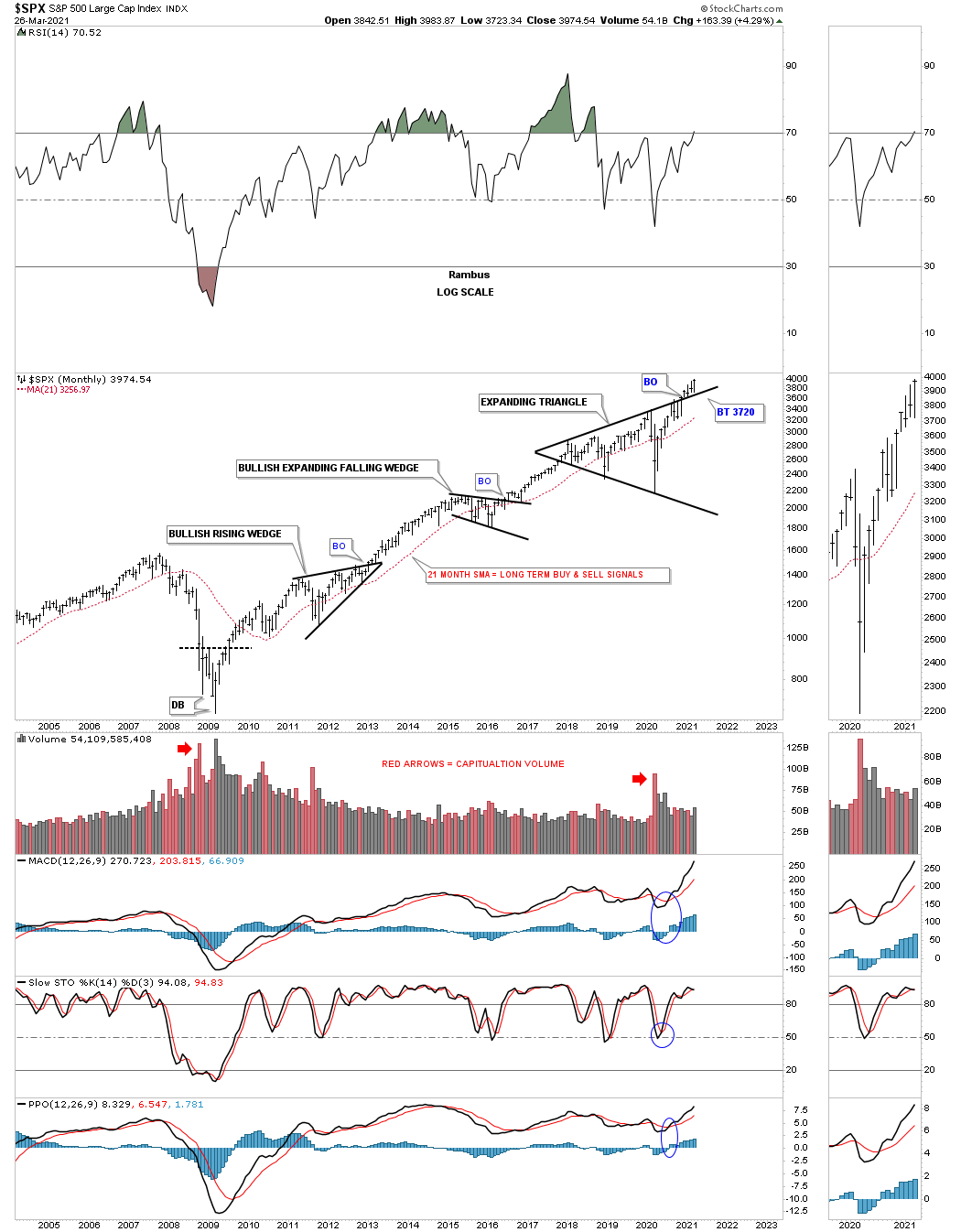
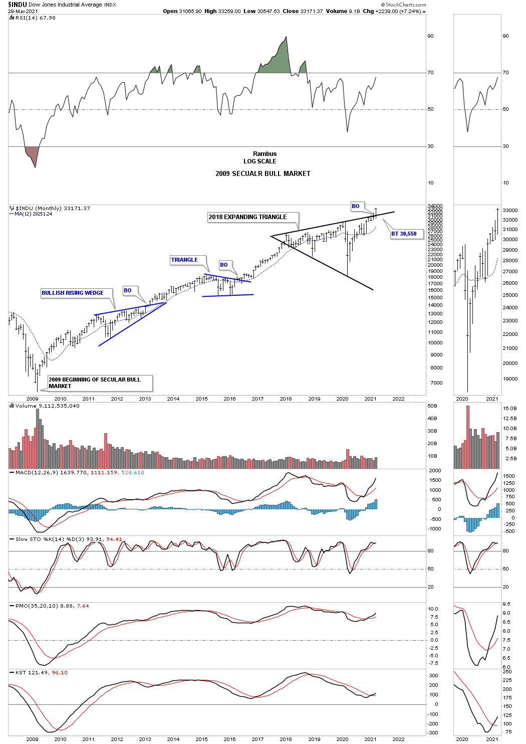
As we go back further in time the 2009 secular bull market is becoming more obvious to those that can keep an open mind. This long term monthly chart shows you classic Chartology at its best. A stock or market does only one of 3 things. It is either building out a reversal pattern top or bottom, a consolidation pattern or is in an impulse move. Note the 2009 bottom with a strong impulse move to the first reversal point in the bullish rising wedge. Once that consolidation pattern was completed, began the 2nd impulse move of the new secular bull market that ended with the bullish expanding falling wedge. When that consolidation pattern completed the 3rd impulse move began that ended with the first reversal point in the 2018 expanding triangle which led to the biggest correction of the entire secular bull market to date. From a Chartology perspective the odds are extremely high that the 4th impulse move in the secular bull market is just now getting underway. Keep that 2018 expanding triangle in the back of your mind as it will show up again in the longer term charts.
Now let’s go back 25 years in the past so you can see the end of the previous secular bull market that ended in 2000 and the 13 year expanding flat top triangle consolidation pattern that was needed to correct that previous 26 year secular bull market. Note the beautiful internal structure of the 2013 bullish flat top expanding triangle starting with a reversal pattern at the reversal points, 2000, 2002, 2007 and 2009. There was the blue bullish rising wedge that formed as a halfway pattern in 2005 and 2006. There was also the blue bullish rising wedge which formed just below the top rail of the 2013 flat top expanding triangle that we already discussed which is usually a very bullish setup. The first consolidation pattern to form after the breakout from that massive 13 year consolidation pattern was the 2016 bullish expanding falling wedge. Again note the near vertical moves that take place once a consolidation pattern has done its job of consolidating the previous impulse move.
Here again you can see the recent low the RSI made while the SPX is breaking out to new all time highs. This gives the SPX a lot of room to run higher before the RSI gets overbought again. What amazes me most when I look at the rally out of the 2009 crash low is how many investors have denied the existence of one of the greatest bull markets of all time because the fundamentals say it shouldn’t happen. These types of rallies are extremely rare and may only happen once and if you are lucky twice in ones investing career. Again, keep your eye on the 2018 expanding triangle as I promise you it will come into view again in the longer term charts to follow.
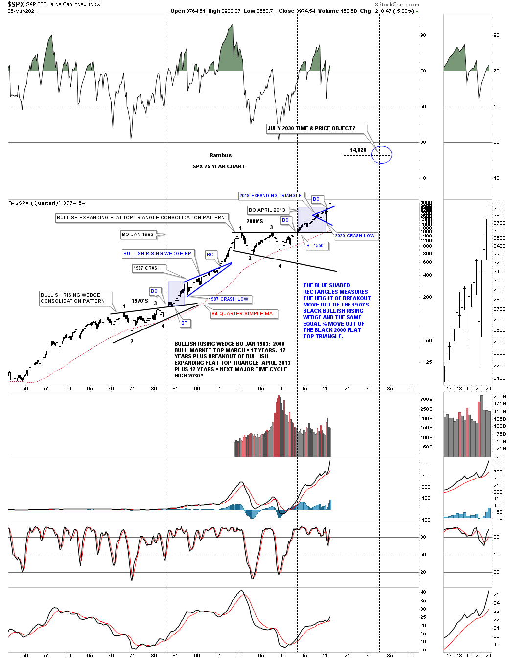
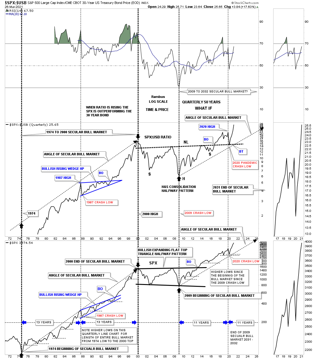
So what does a secular bull market look like? Below is a 75 year quarterly chart for the SPX we’ve been following since the breakout from its massive flat top triangle consolidation pattern in 2013 when just about every other US index and world stock markets broke out of their respective massive consolidation patterns. This big picture look shows no signs of ending anytime soon. We just experienced one of the biggest crashes in the history of the stock market a little over a year ago and still the SPX is trading right at its new all time highs.
For those that haven’t seen this chart before you can see the massive consolidation pattern, the bullish rising wedge halfway pattern, which formed as a resting area for the previous secular bull market. Note the blue shaded areas that formed during the 1987 crash and the current one that shows the 2020 crash. The blue shaded areas measures the height only and not time. The initial rally out of the 1970’s bullish rising wedge to the top in 1987, just before the crash, is almost identical to the height of of the 2020 high before our recent crash that many believe we are still in. If we are truly in a secular bull market, which is where my money is, we won’t see the 2020 crash low ever again.
The breakout from the 1970’s black bullish rising wedge took place in January of 1983 and ran until the top in 2000 which took 17 years. The breakout from the 2000’s flat top expanding triangle took place almost 30 years later and shows no sign of failing. If our current secular bull market, as measured from the April 2013 breakout point should last at least 17 years that would put the time component to around the 2030 area. For now that is a rough estimate which we can fine tune as time goes on. Note how the red 84 quarterly moving average was only breached 2 times in the last 70 years, once during the formation of the 1970 massive bullish rising wedge and the 2nd time during the formation of the 2000’s flat top expanding triangle.
As long as a scenario is working there is no need to change anything. Since the breakout from the 2000’s flat top expanding triangle in 2013 nothing has changed in order for me to reconsider the possible long term scenario. Even the 2020 crash which was one of the strongest and quickest correction in the history of the stock markets wasn’t able to change the big picture in any meaningful way.
Now you can see how the 2018 blue expanding triangle we that looked at on the charts above fits into the secular bull market. Using this scenario as a road map for time and price for our current secular bull market we have a time component around 2030 with a price objective around the 14,826 area. This in not set in stone as we are talking many years but as long as the price action keeps working and moving the right direction as it has been since the 2013 breakout we’ll stick with the game plan until something changes.
There is one more 50 year quarterly ratio combo chart I would like to show you in regards to the secular bull market. The ratio chart on top compares the SPX to the USB, 30 year bond, with the chart on the bottom being the SPX. There is really a lot of information on this combo chart but the main takeaway is that when the ratio chart on top is moving higher so is the SPX, they really have a pretty good correlation. On the left side of the chart you can see the secular bull market that ran from 1974 to the 2000 high in both the ratio and the SPX which began a multi year consolidation phase. Now look at the beginning of our secular bull market that began in 2009 and you can see the exact same thing happening again. Even the 2020 crash low has held support above the previous quarterly low.
The SPX formed the 2000 flat top expanding triangle as its halfway consolation pattern but the ratio chart on top formed a large H&S consolidation pattern that I’m viewing as a halfway pattern. Note where the 2020 crash low found support, right where it needed to on the backtest to the neckline.
The heavy black dashed vertical lines show the 1974 to the 2000 secular bull market with the blue consolidation pattern being a halfway pattern. Our current secular bull market began at the March 2009 crash low and is following the same angle of ascent as the ratio chart on top which is slightly less steeper than the 1974 to the 2000 secular bull market. The time component shown at the bottom of the chart suggests we should have 11 more years of bullish price action starting at the 2020 high just before the crash. The time component from the equal high in 1987 was 13 years to reach the secular bull market high in 2000.
There is other information on this chart that I don’t have the time to go into right now but there is one last thing I would like to point out to you. Starting at the very beginning of the last secular bull market that started in 1974 note how the price action never traded lower than the previous quarterly low for the entire bull market, as shown by the thin black dashed horizontal lines on the SPX.
I’ll have more charts tomorrow in Part 2 showing the big picture. All the best…Rambus
Before we look at some of the world stock markets I would like to show you 2 more pieces of evidence that says at a minimum the stock markets are on a long term buy signal. To reverse these buy signals it will take some serious work by the bears to change the Chartology from bullish to bearish. Anything is possible when it comes to the markets but usually there are some warning signs that start popping up first giving you a yellow warning flag. And if things start to deteriorate further then the red flag comes out.
So far in regards to the US stock markets I don’t see any yellow warning flags yet just some chopping action for the most part. There has been some strong rotation from some of the stronger sectors that led the markets out of the March 2020 crash low to some of the lagging sectors. This is a healthy development in the long term.
There is one indicator that I know most of you are familiar with if you’ve been in the markets for any length of time and that is the Dow Theory Buy and Sell signals. I’m not going to go into great detail on how it works but the fact that both the INDU and the Transportation Average are both breaking out to new all time highs is a confirmed buy signal. Until they both make intermediate term lows the buy signal will stay in place.
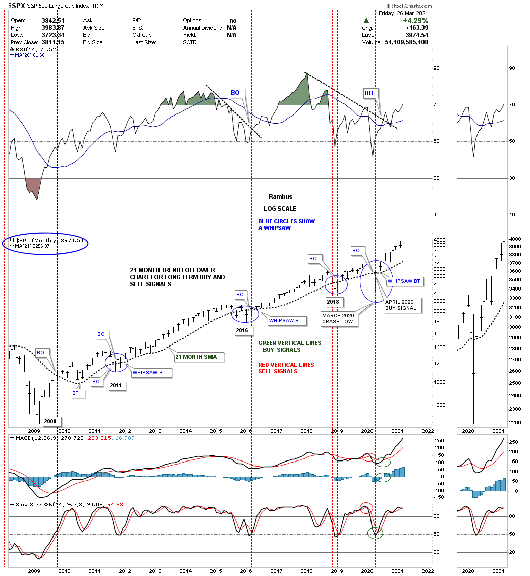
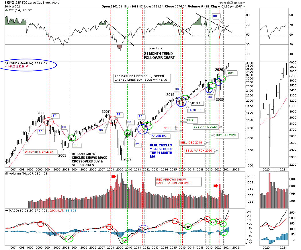
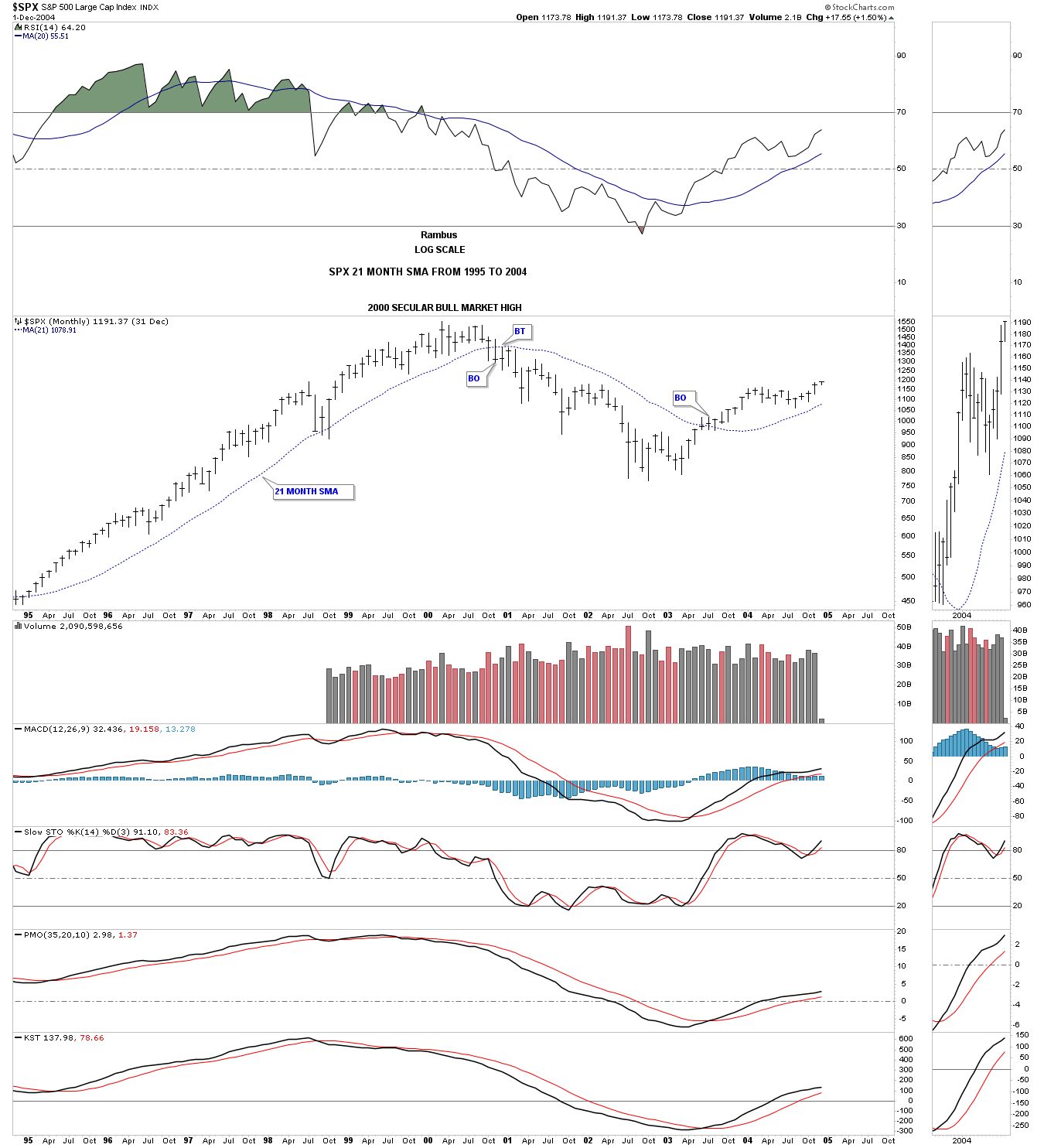
There is another indicator I like to use for long term buy and sell signals and that is the 21 Month Trend Follower chart for the SPX which is completely mechanical. The only emotion involved is the ability to pull the trigger when a signal is given.
The basic principal is to go long when the price action closes the month above the 21 month sma and to go short when the price action closes the month below the 21 month sma. I like to call the 21 month sma a moving trendline because it works just like a straight trendline. When the price action breaks below a straight trendline many times it will reverse its role to resistance on a backtest from below. The 21 month sma does the exact same thing. A buy or sell signal is only given at the end of the month and depends on whether the SPX closes that month above or below the 21 month sma. As long as the SPX trades above the 21 month sma you are on a long term buy signal but once the price action closes a month below the 21 month sma you get a sell signal and can go short as long as the 21 month sma holds resistance. It doesn’t get any more basic than that.
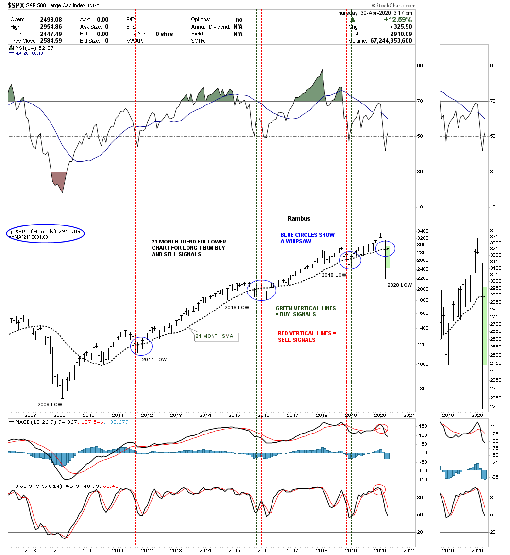
As you know the markets were crashing in 2020 and finally bottomed in March. At the end of March the SPX was still trading below its 21 month sma so no new buy signal was given. We had to wait until the end of April before we would know if there would be a new buy signal given. I still remember clearly when we got to the end of April and I brought forth the new 21 month buy signal that was just barely triggered. Keep in mind the bearish mindset that was in place back then. No one knew including me what was going to happen in a month or six months or a year down the road. All I knew was the 21 Month Trend Follower Chart just gave a long term buy signal and I had to act on it.
This is what I wrote on the Market Update on April 30, 2020.
We’ve finally made it to the end of the month trading for the SPX and the 21 month Trend Follower chart for long term buy and sell signals. With about a half hour to go before the close the SPX is currently trading at 2910 with the 21 month sma at 2892 which will put the SPX on a long term buy signal if it holds into the close. If this is a true long term buy signal the 21 month sma should now act as support from above. Also the price action can trade below the 21 month sma inter month but must close back above the 21 month sma by the close to keep the long term buy signal alive. Needless to say we are at a critical juncture right now in regards to the stock markets.
Below is the chart I posted at the time showing how the 21 month sma had just given a long term buy signal. As you can see it wasn’t by much but it was indeed a new buy signal. As long as the SPX traded above the 21 month sma into the future the SPX would remain on a long term buy sighal.
Below is the current SPX monthly chart that shows where the buy signal was given. In order for a new sell signal to be generated the SPX will have to close a month below the 21 month sma which is a long ways down. The blue circles show where there was a whipsaw when the SPX closed below the 21 month sma since the beginning of our secular bull market that began in 2009. If you look closely at each blue circle you will see the sell signal only lasted one month before the SPX rallied back above the 21 month sma for a brand new buy signal. The only exception was the 2015 – 2016 correction where there was a double whipsaw. Even the 2020 crash produced just a one month correction before the SPX was able to trade back above that moving average in April for a new buy signal. You can see how long the impulse moves can last between each consolidation pattern before the 21 month sma gives a sell signal.
This is a longer look at how the 21 month sma has done over the last 25 years or so. The red circles show the sell signals and the green circles show the buy signals while the blue circles show the whipsaws. As you can see the 21 month sma would have gotten you out just before the bear market that began in 2000 and again gotten you out just before the bear market in 2007. Also note how well the 21 month sma held support during each impulse move between the consolidation patterns.
This last chart for the 21 month sma shows how well it did during a nearly 10 year period from 1995 to 2004. There was just one sell signal at the 2000 all time high and one buy signal after the bear market low in 2002. The 21 month sma is a good tool to have in your Chartology toolbox.
I mentioned in Part 1 of this report that the dominate long term chart pattern is the expanding triangle. This pattern came about because of the Coronavirus panic that ended in March of 2020. As you will see it is not just in the US but many countries as well. We’ll start with some US stock markets and work our way out to some of the more important stock markets in the world.
My job isn’t to sway you from how you believe the markets work but to give you an unbiased opinion of what the Chartology is strongly suggesting. It is up to you to make up your own mind on what direction you want to trade.
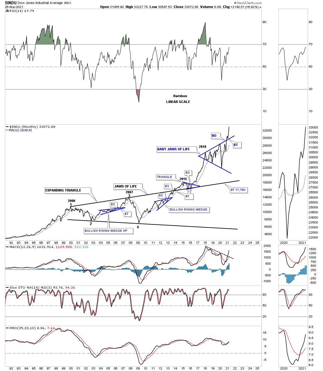
INDU:
INDU: Quarterly Jaws of life and secular bull markets.
Quarterly line chart for perspective.
Daddy Jaws of Life and baby Jaws of Life.
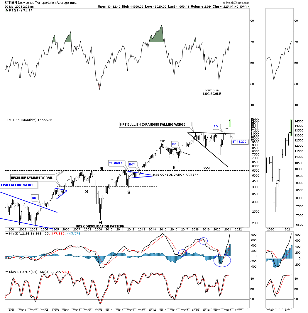
Transportation Average:
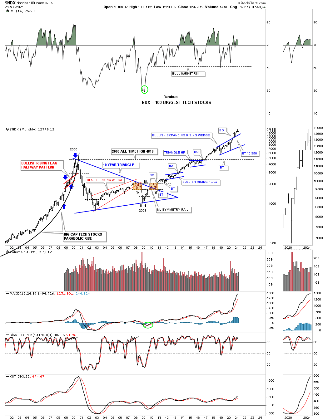
NDX 100 big tech stocks.
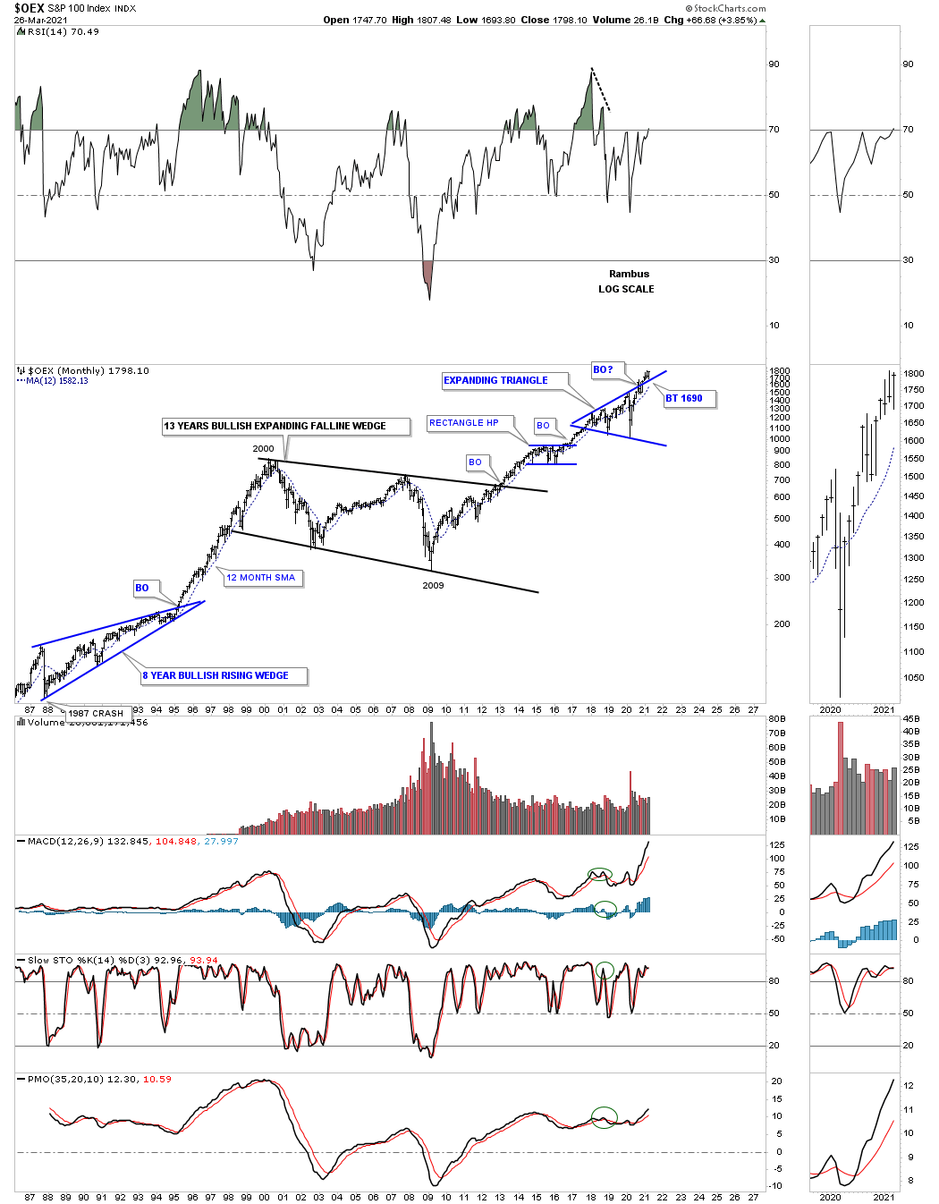
OEX 100:
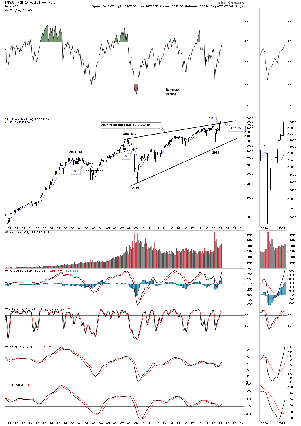
NYA broad range of stocks?
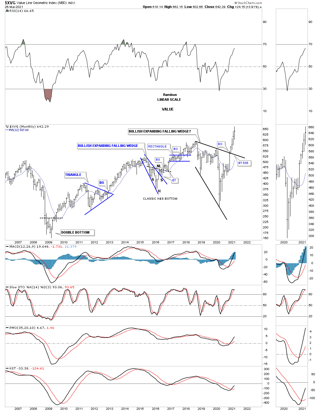
XVG value:
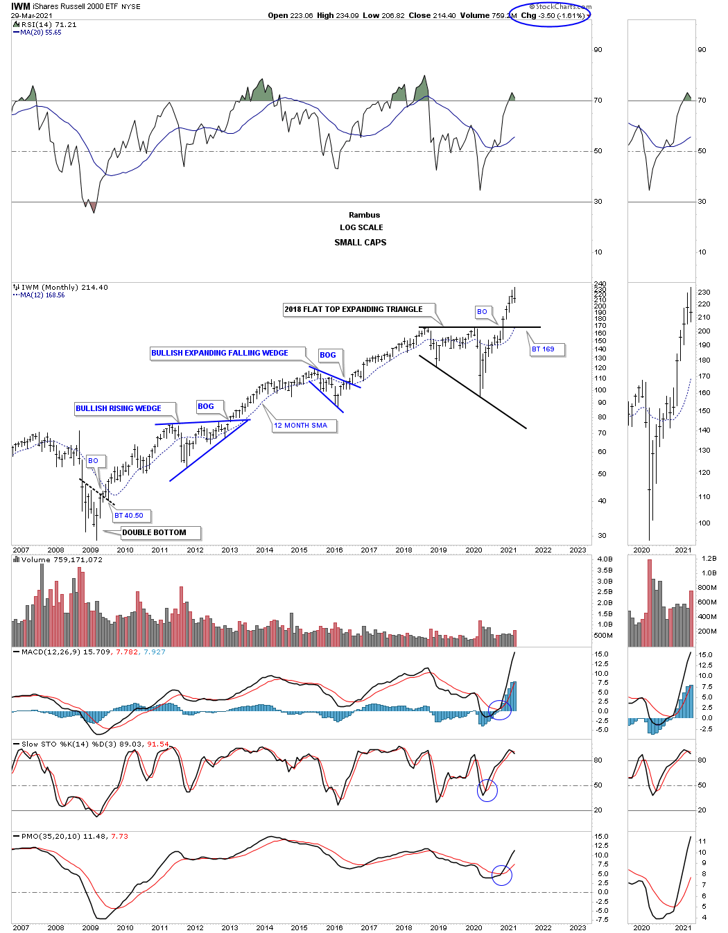
IWM small caps.
French stock market.
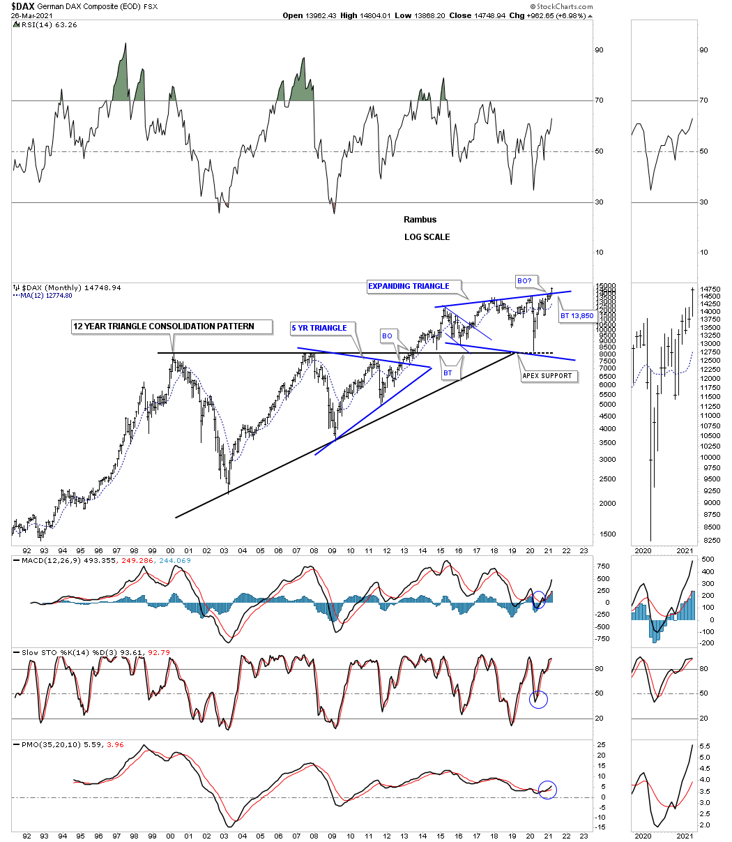
DAX German stock market breaking out of expanding triangle.
AORD Australian stock market on the verge of breaking out.
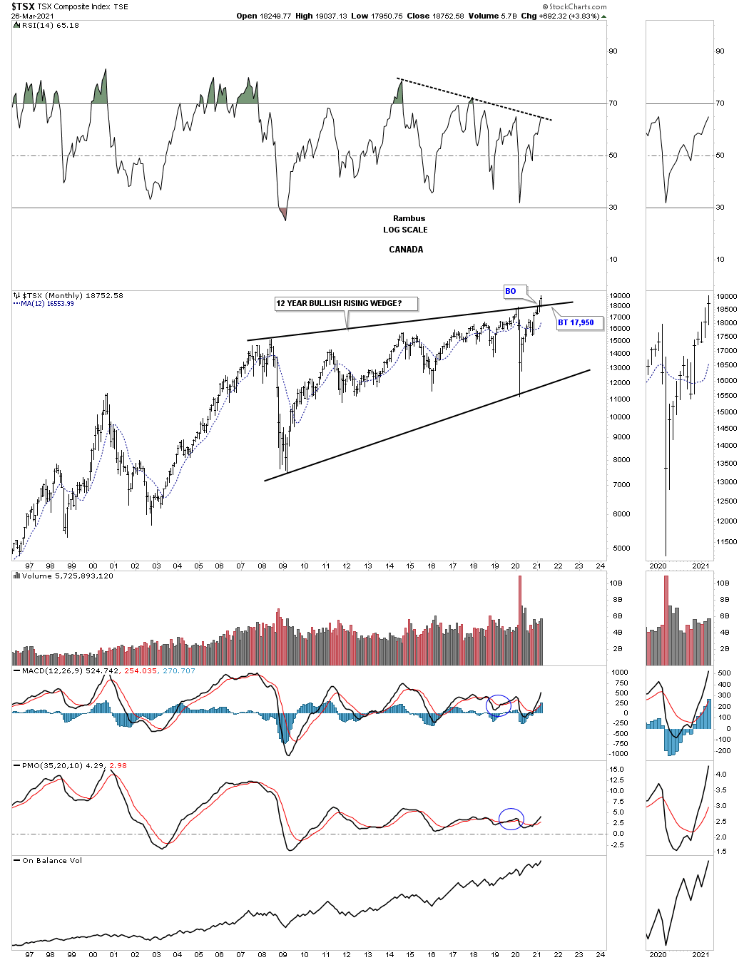
TSX Canadian stock market breaking out.
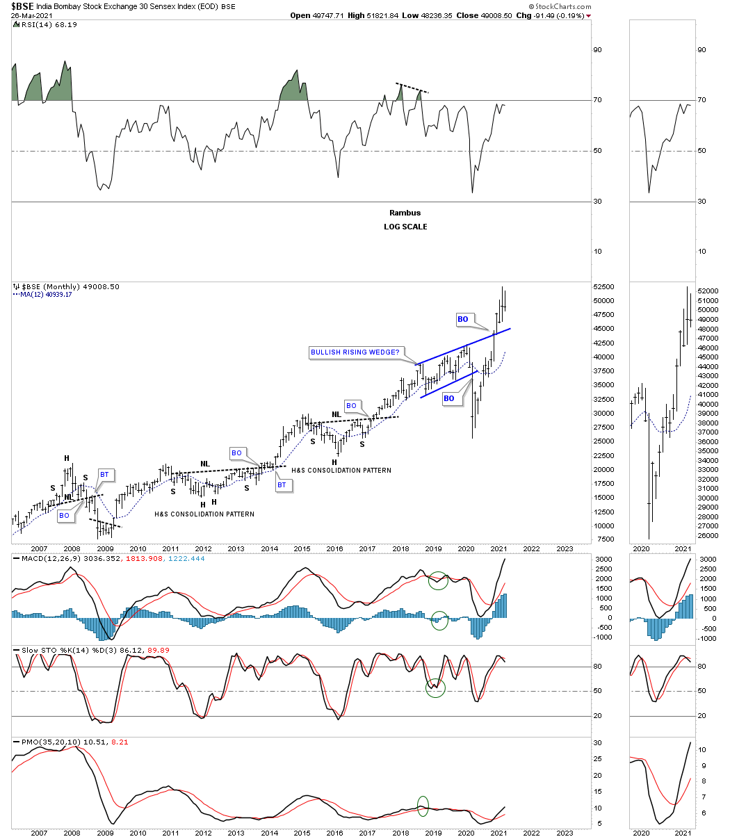
BSE India stock market.
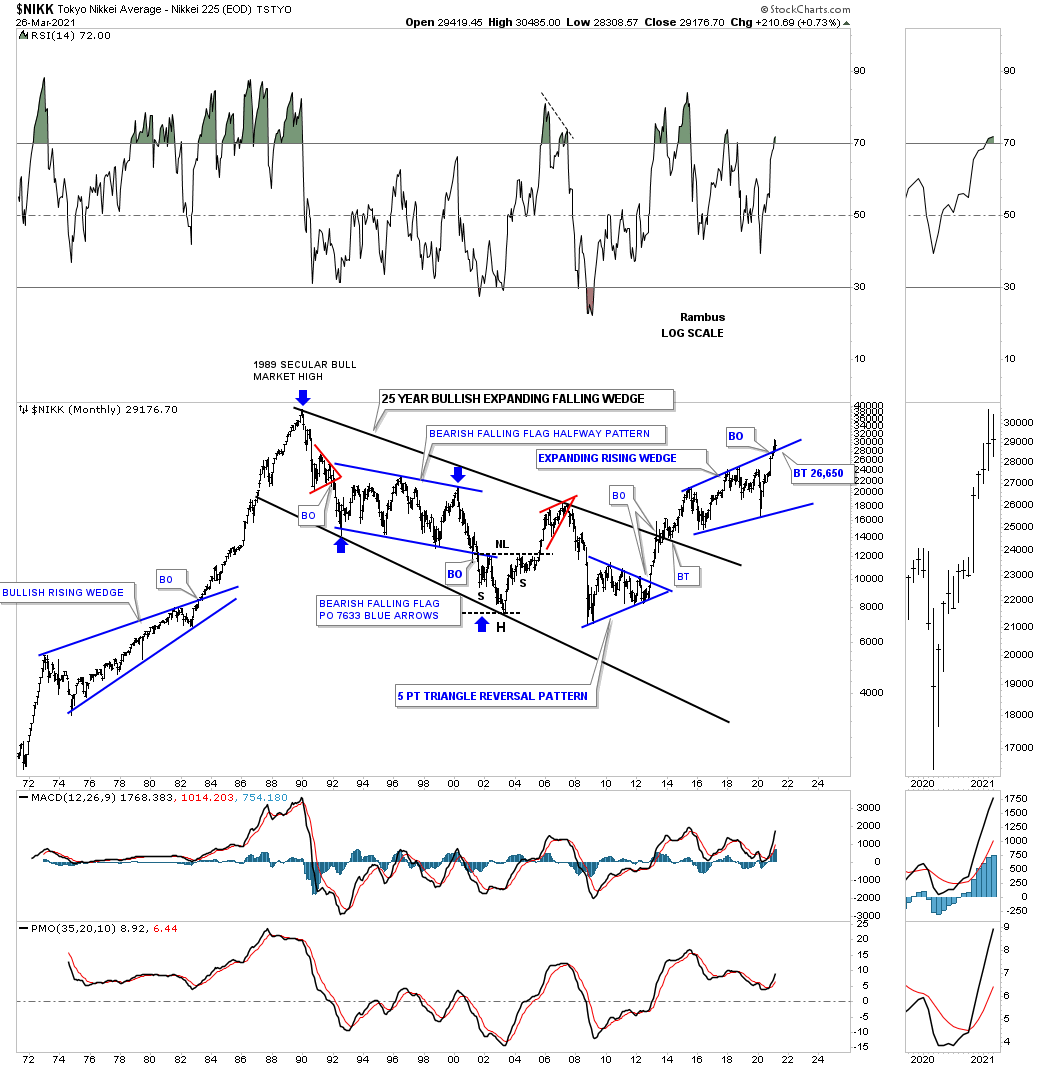
NIKK Japan stock market breaking out from bullish expanding rising wedge.
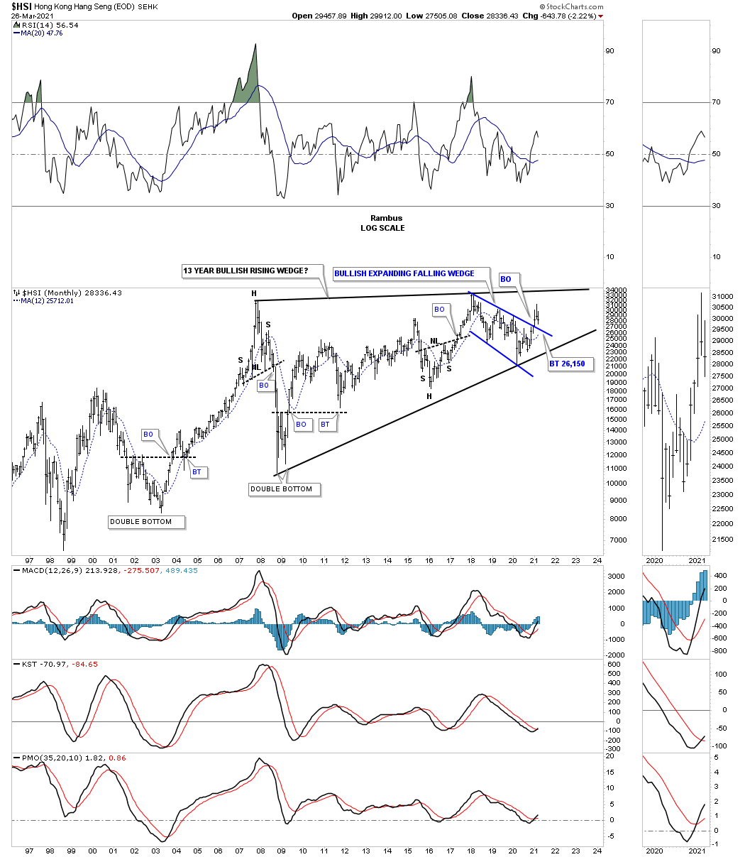
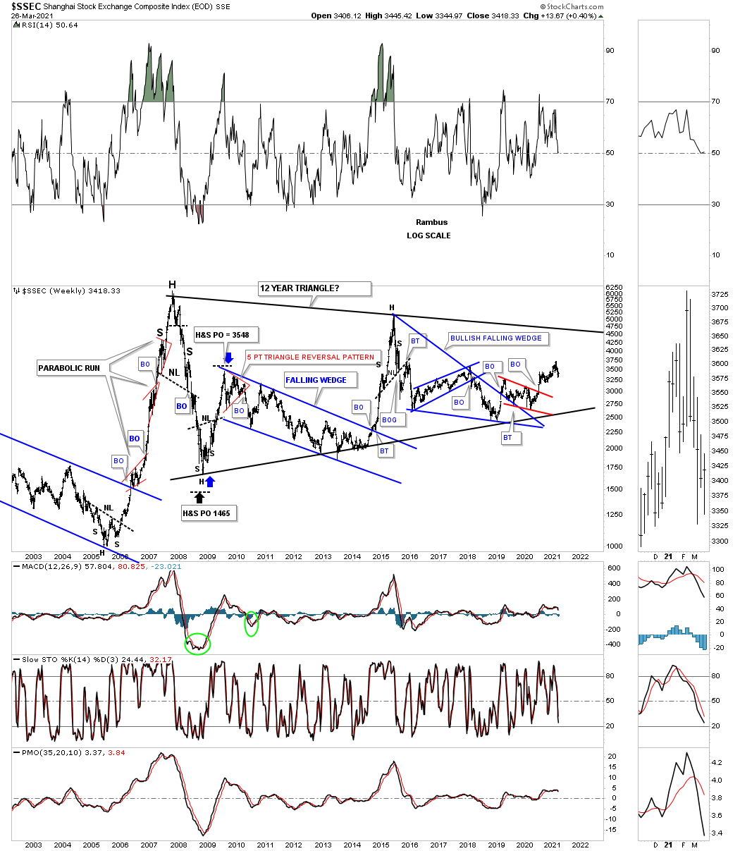
China stock market one of the weaker world stock markets.
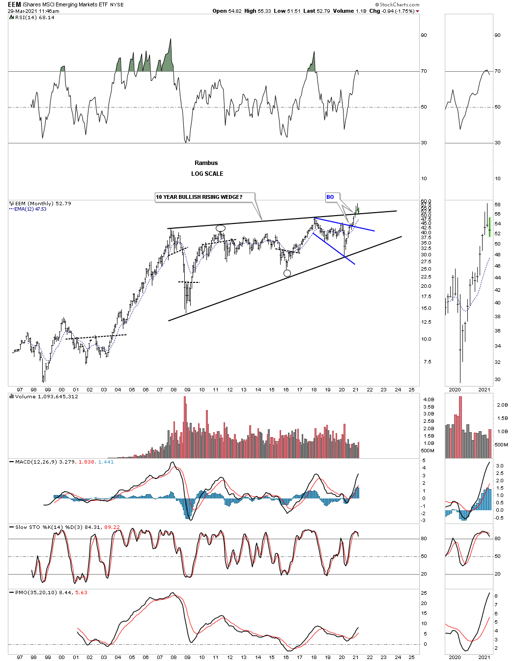
EEM emerging markets.
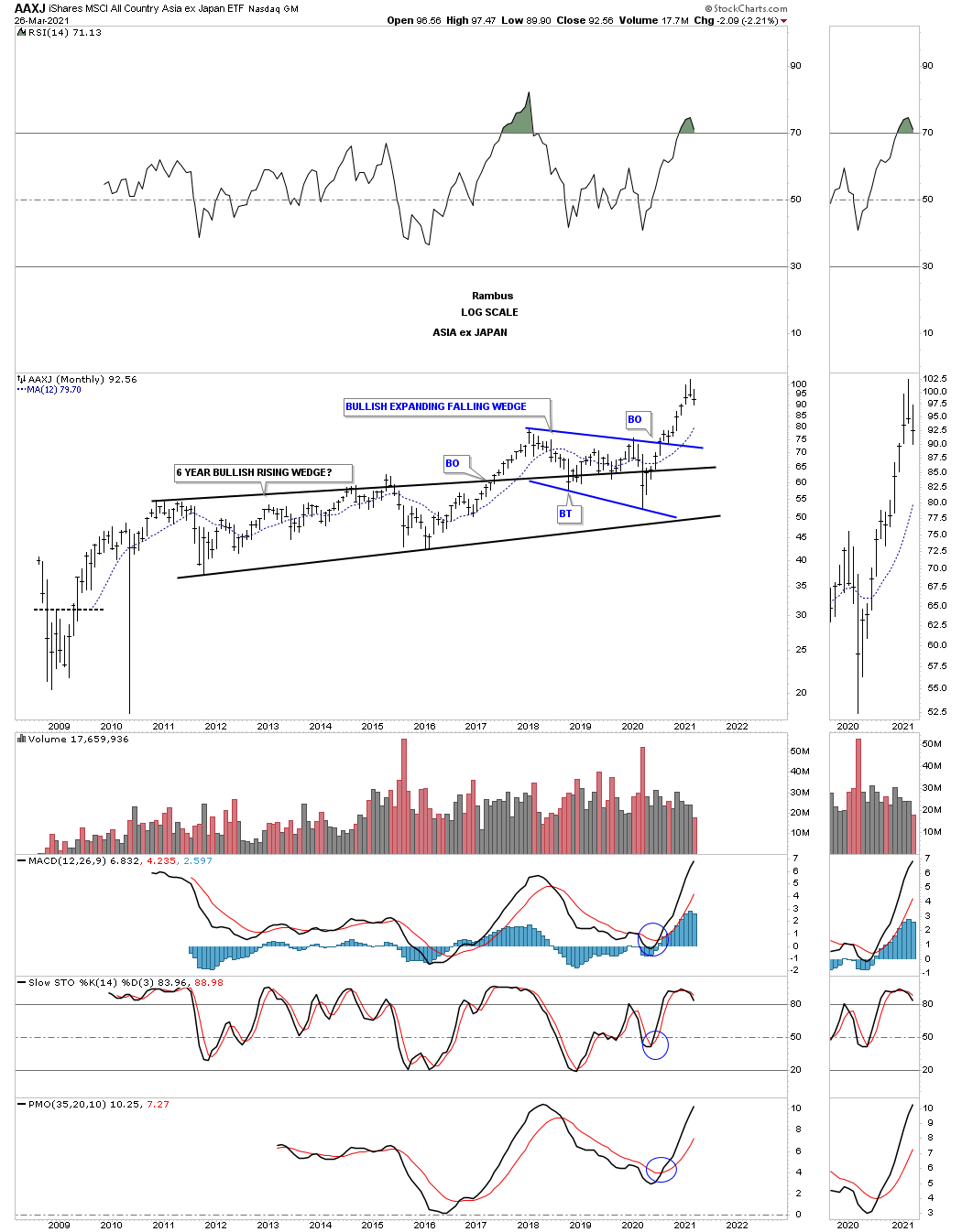
AAJX Asian stock markets ex Japan.
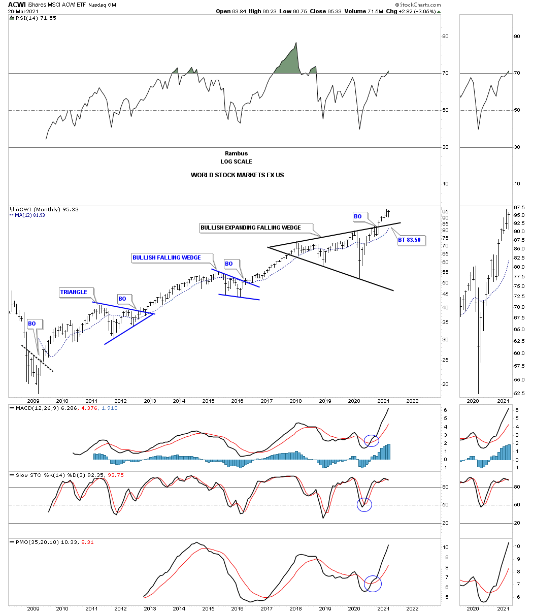
ACWI wold stock markets ex the US.
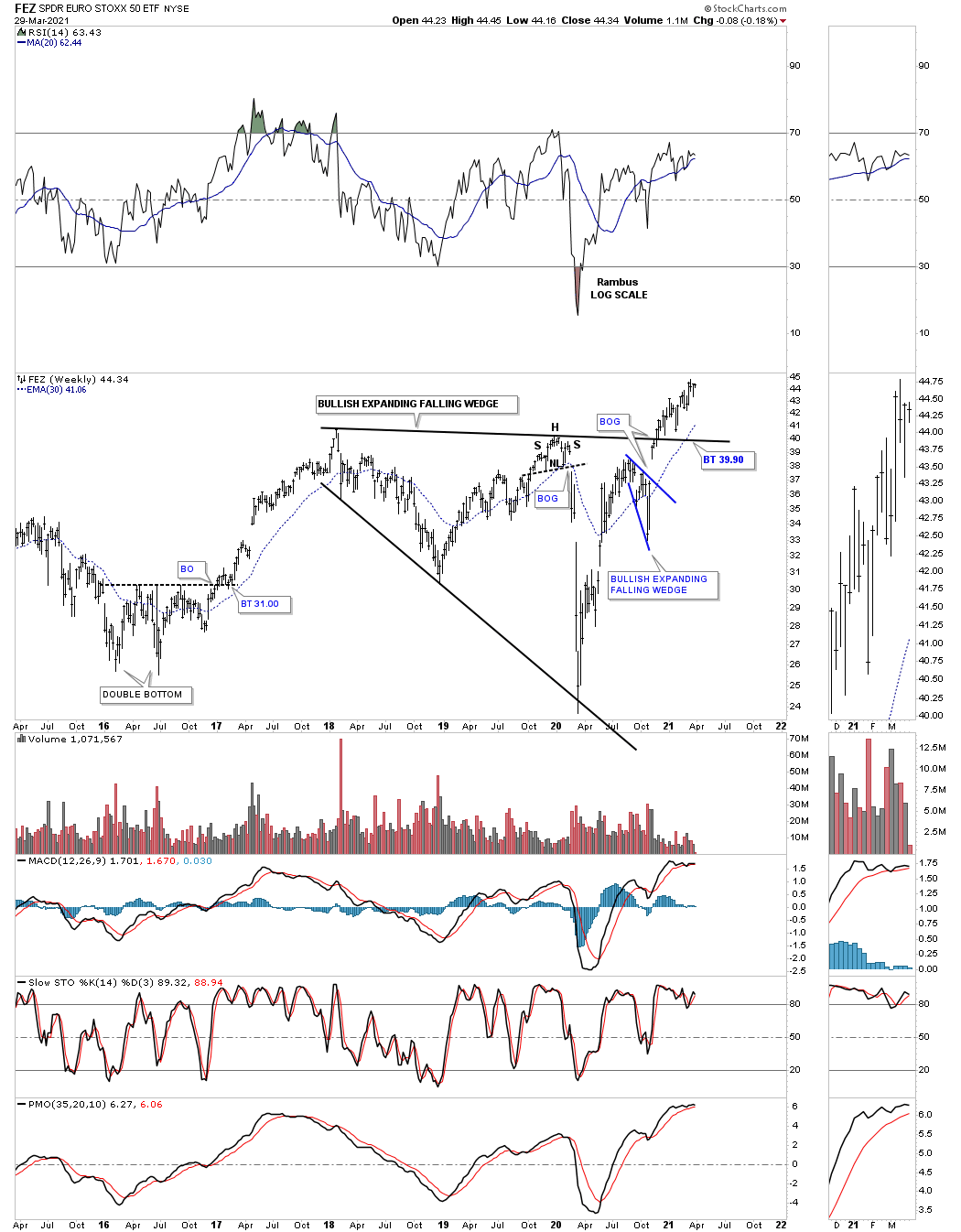
FEZ euro STOXX 50 weekly:
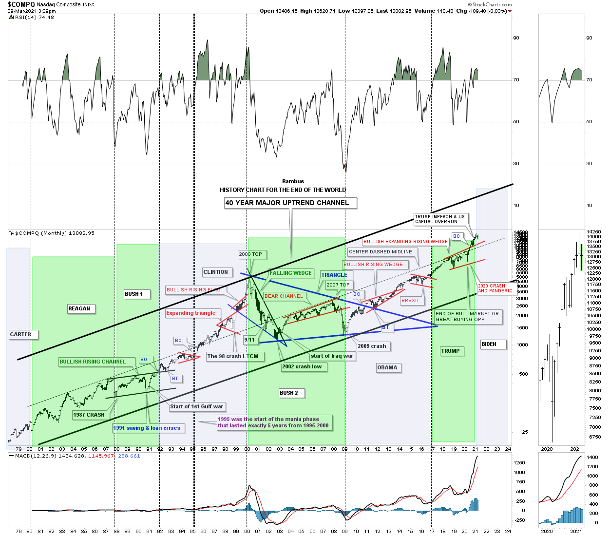
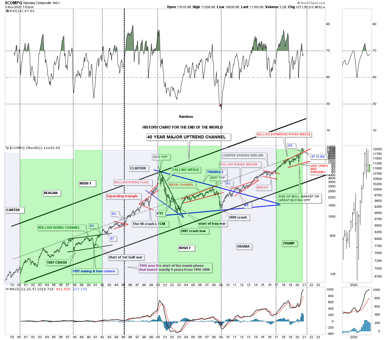
This last chart for this Quarterly Report for the US and World Stock Markets I call the “End of the World History Chart.” This chart shows all the events that felt like the end of the world if you were trading the markets when they occurred.
This is what I wrote on Election Day November 3rd, 2020.
I’m headed out to do my civic duty and vote. I have no idea how long it will take so I’m going to post this chart now.
For those that have been with Rambus Chartology for awhile know about this long term monthly chart that goes all the way back to the late 1970’s which I call, The End of the World History Chart. It is a satirical look at all the important lows that felt like the end of the world if you were trading back then. Every time there is an end of the world type of event I just add it to the chart to see what happens. The 2020 crash was the latest end of the world event in which I stated, “end of the bull market or a great buying opportunity,” shortly after the low was in place.
The center dashed midline has been holding resistance for the last 20 years or so. I can’t tell you how long I’ve been waiting for the breakout above that 20 year center dashed midline which I believe could lead to a rally up to the top rail of the major uptrend channel similar to what we saw back in 1995. When the center dashed midline gave way back in 1995 that was the beginning of the parabolic rise into the 2000 secular bull market top which took five years to complete. It is simple, above the center dashed midline is bullish and below is bearish, everything else is noise.
I recently added the presidential cycles to this chart so you can see how the COMPQ responded to a Republican or Democratic president. I won’t go into detail as it is pretty self explanatory. The green shaded areas show what the market did when a Republican was in office and the blue shaded areas show what the stock market did during a Democratic president.
I’m going on record right now with my prediction on what the stock market is going to do if a Republican or Democrat is elected. One year from today the stock market is going to be higher whether a Republican or Democrat is elected. We are not going to see the end of the world or the end of our Democracy regardless of who is elected.
My cup has been and still is half full regardless of all the conspiracy theories that are so widespread right now which probably seems pretty naive to many of you. We are entering into a technological revolution that is just being born that is going to change the world in ways we can’t even imagine yet whether we like it of not. I’ve touched on it a time or two in the past and nothing has changed my outlook on what is about to take place over the next 5 to 10 years.
For those that want to fight the last battle and expect the world to come to an end be my guest. I’m going to look to the future which is not going to be perfect by any stretch of the imagination, and welcome change which is the lifeblood of being a human being.
Below is the End of the World History Chart I posted on Election Day November 3rd, 2020.
This the same End of the World History Chart as of today, 3-29-21. All the best…Rambus
The PM Complex
Gold Part I: An Honest Look at Gold’s Chartolgy
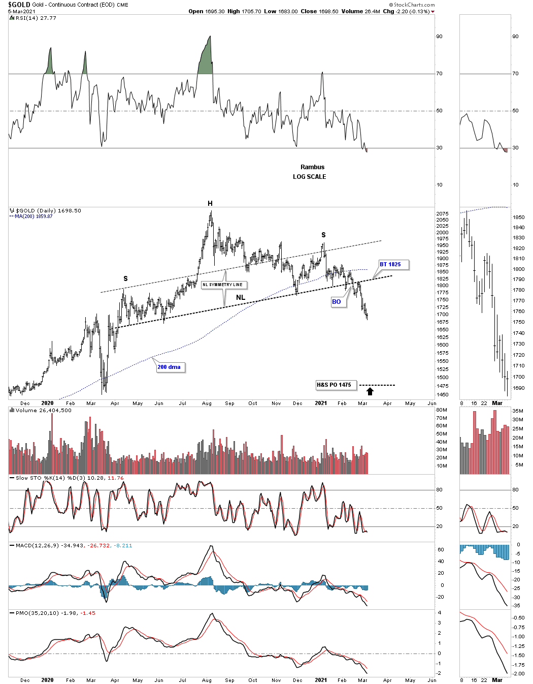
As you well know the PM complex has been trading at a very important inflection point for the last month or so looking for the next important move either up or down. I can make a case today for either direction but the Chartology is strongly suggesting the next important move is going to be to the downside. In the very short term, days to maybe a week or so we could see some backtesting to many important necklines that have already given way.
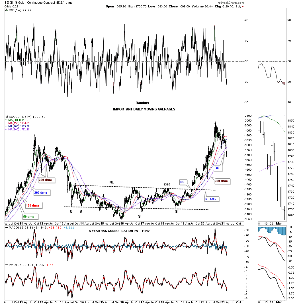
Lets start with a few important moving averages that in the past gave us our first warning that things could start to get a little rough. These aren’t big deals in and of themselves but they do throw up a little red flag that says, pay attention.
During the bull market years I used a ribbon of 4 different moving averages that when they became all properly aligned to the upside they told us that gold was very strong. The 300 day sma was the most important moving average for the long term health of gold. Throughout the bull market that began in 2000 until the high in 2011 the only time the 300 day sma was violated was during the 2008 crash.
Up until last week the ribbon of 4 moving averages had gotten proper aligned just before the H&S bottom neckline was broken to the upside in 2019. As you can see the 300 day sma held support in the spring of 2020 and saved the day for gold. Again, it is not the end of the world but Gold has now traded below its 300 day sma for 7 days in a row now which is allowing the shorter term green 50 day sma to start rolling over along with the red 150 day sma. In a strong bull market it is never a good thing to see these important moving averages rollover especially the longer term moving averages.
Below is a weekly chart for gold which shows just the 10 and 50 week moving averages without the price of gold. Normally when these 2 moving averages become properly aligned they can keep a buy signal going for years at a time. Normally when you see these two moving averages start crossing back and forth it tells you gold is either building out a reversal pattern or a consolidation pattern. The last buy signal was given back in January of 2019, last green circle. Last week the 10 week closed below the 50 week giving its first sell signal in a little over 2 years, red circle.
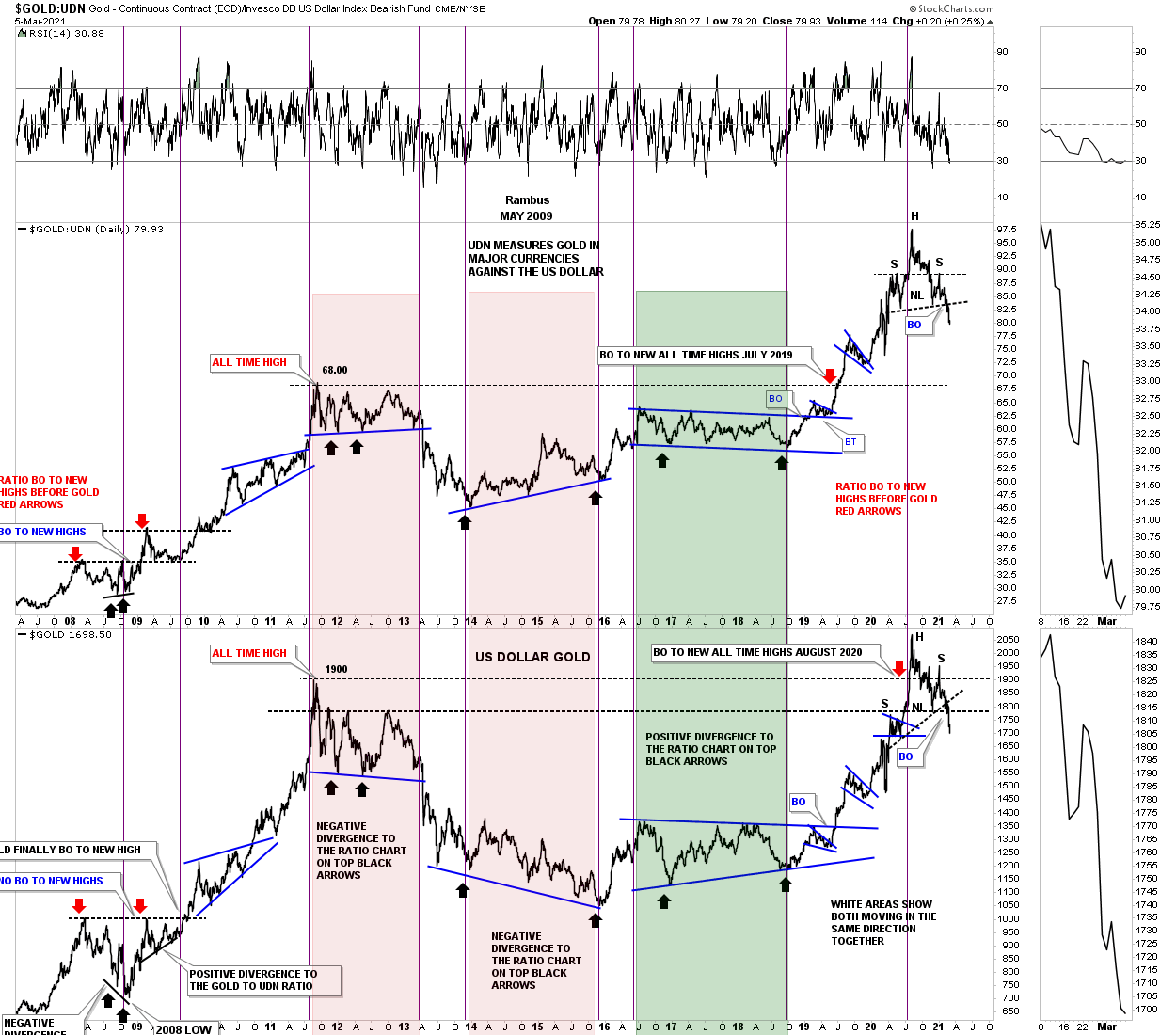
Another important sign that gold may be in trouble is the ratio combo chart we looked at a couple of weeks ago that has the GOLD:UDN ratio on top with gold on the bottom. During a strong bull market these 2 generally move up together, sometimes with the GOLD:UDN ratio which means gold in most of the important currencies of the world leading the way and sometimes gold in US dollar having its turn. If you recall we were looking at the potential H&S top on the GOLD:UDN ratio which has come to fruition. Again, this is not what you want to see during a bull market.
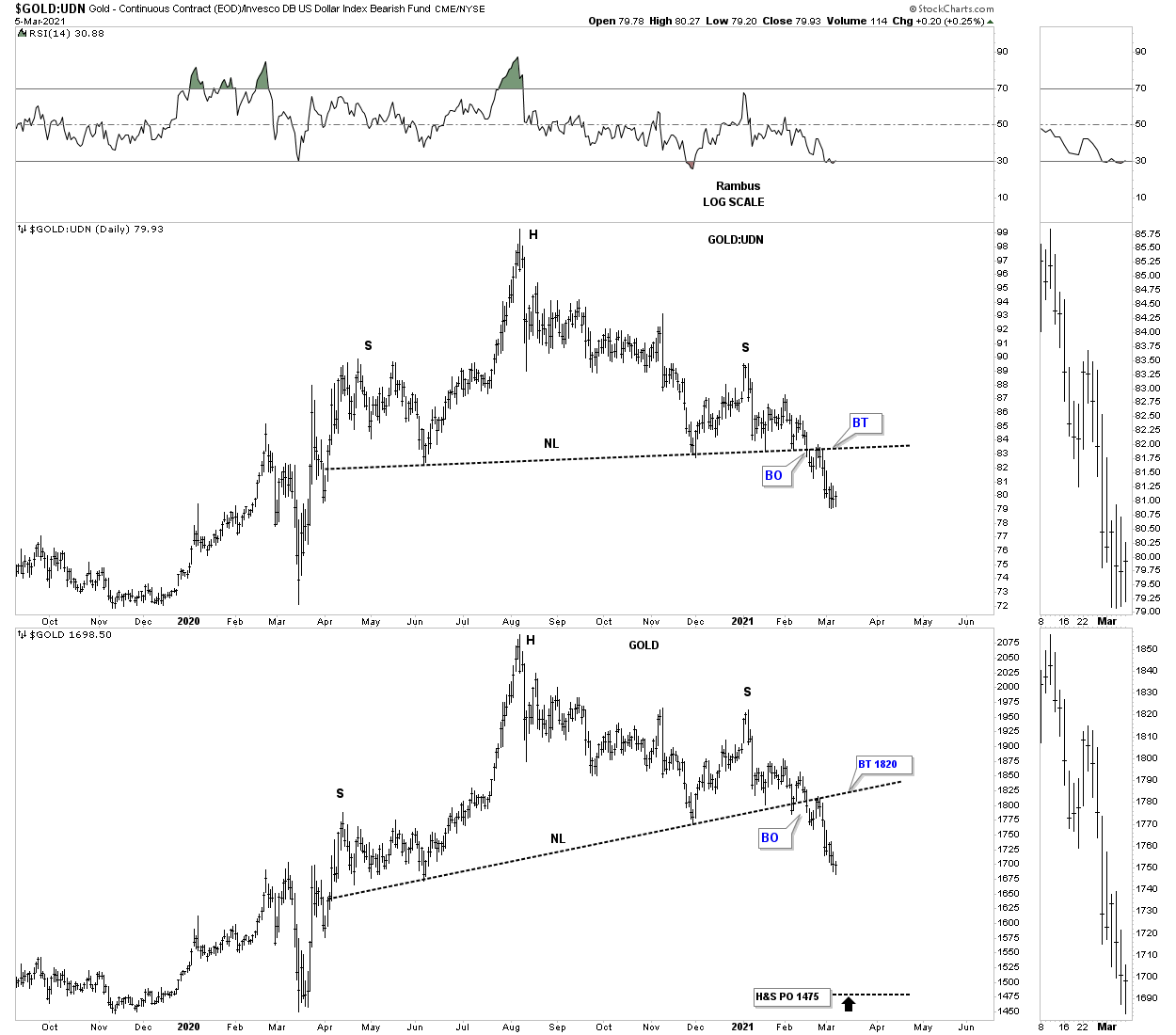
Below is a daily combo chart which has the GOLD:UDN ratio on top with gold on the bottom for a closeup view of the H&S tops on the ratio combo chart above. Since they both have had a backtest shortly after breaking out below their neckline is it possible we will get a 2nd backtest or has the impulse move down already begun in earnest?
This stand alone chart for gold shows the H&S top price objective down to the 1475 area.
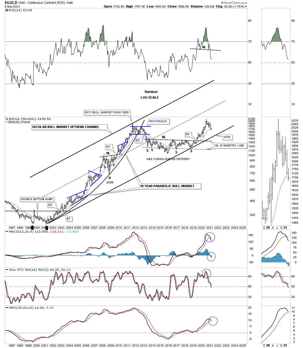
Looking at the long term bull market for gold this 25 year monthly chart shows its secular bull market uptrend channel. This month is far from over yet but gold is starting to trade below its all important 20 month ema which it never broke during the bull market years as shown on the left side of the chart except for the 2008 crash.
The daily chart above showed us a price objective down to the 1475 area which would coincide with the bottom rail of the secular bull market. A move to the bottom trendline wouldn’t be any fun but it wouldn’t hurt the bull market either. Please take a second and study the blue consolidation patterns that formed during the 2000 to 2011 bull market and compare those consolidation patterns to the price action from the all time high made back in August of 2020. Our current trading range is still very small in regards to the size of the bull market. Perspective is everything.
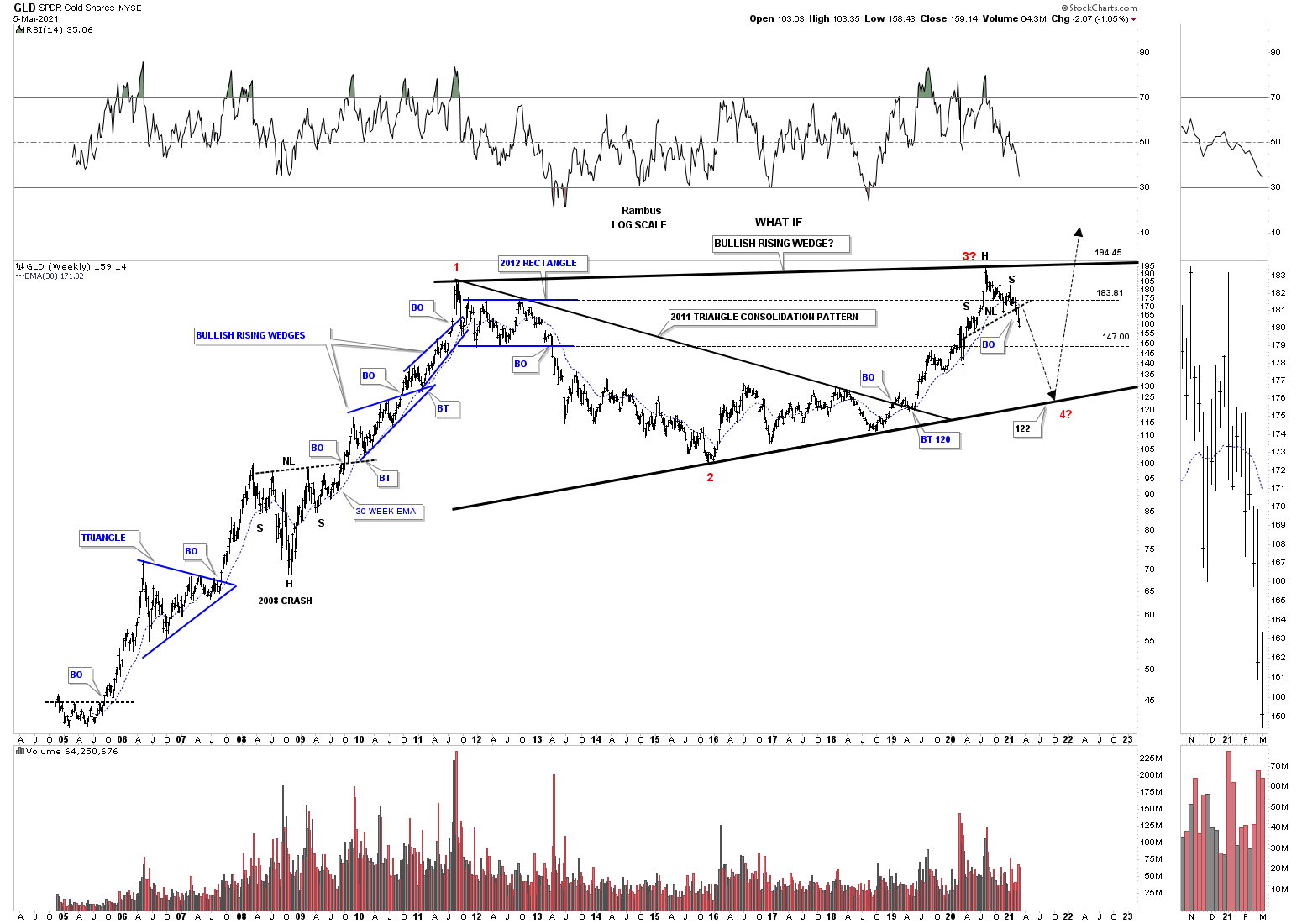
This next chart is a long term weekly look at GLD that I haven’t shown you before. I know you are going to think I’ve lost my mind with this chart but from a Chartology perspective it makes perfect sense now that we are getting more information to work with. We’ve discussed many times in the past how you can find important reversal patterns at the reversal points in big consolidation patterns. The H&S top that we looked at earlier on the daily chart is the same H&S top at reversal point #3.
GLD should have caught support on top of the 2012 blue rectangle around the 183 area but it didn’t hold. GLD then should have found support above the 30 week ema which has now turned down. The next area of support will be at the bottom rail of the 2012 rectangle around the 147 area. There is no law that says GLD has to trade all the way down to the bottom rail of what I’m calling a bullish rising wedge which would end up being a much bigger 2011 bullish rising wedge consolidation pattern in the secular bull market. If that is going to be the case then we have to put in the all important 4th reversal points which I’m showing as a red four. Keep in mind we have a H&S top reversal pattern in place that has reversed the 2018 impulse move from up to down. The odds are high we will see some type of reversal pattern form when this impulse move to the downside completes.
Know that I take no joy in trying to show you an honest view of Chartology. I have to keep things real no matter what the cost. This is just part 1 with 2 more parts to go before I make my case for a bigger consolidation phase we have been in since August of 2020. I will have Part 2 tomorrow night on the PM stock indexes. All the best…Rambus
Part II:
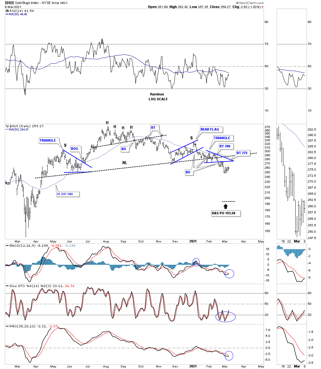
Tonight we’ll look at some Precious Metals Stock indexes that are currently trading at critical inflection points. These are areas that are hard to navigate through because there is no confirmation one way or the other only slight probabilities. At some point the Chartology will become very clear and then you can have more confidence in setting up a low risk trade.
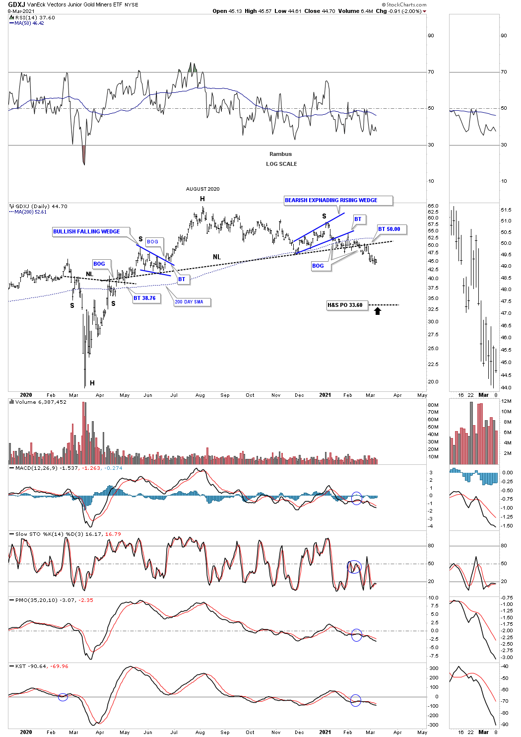
There are 2 dominate chart patterns we’ve been following which are the August 2020 expanding falling wedge and the H&S tops. There is also a third area we’ve been keeping a close eye on and that is the backtest to the top rail of those 2016 trading ranges. The top rail of those 2016 trading ranges should be concrete support so when you begin to see one or two start to fail one needs to pay close attention that a psychological change may be occurring under the surface.
Lets start by looking at the Chartology on the daily chart for the GDXJ which starts with the March 23rd crash low to the present. What we saw shortly after the crash low was that most of the PM stocks also formed a similar H&S bottom which gave us a low risk entry point to begin buying our favorite PM stocks starting on April 2nd. Shortly after the breakout above the neckline it was time for the GDXJ to consolidate its gains forming the 6 point bullish falling wedge. If you look real close you can see the price action gapped above the top rail followed by a 4 day backtest. That small bullish falling wedge gave the GDXJ the energy it needed to reach the August 2020 high where it was time to consolidate those gains. Everything was going as planned into the the August high with an expected consolidation pattern to start forming.
As the consolidation phase wore on the strength of the initial impulse move from the March low to the August high, which was very strong, began to wane somewhat causing a little concern but nothing major. We then got a pretty decent rally into the January 5th high that stalled out at the previous high made on November 6th of last year with the price action failing to make a higher high. That might not sound like that big of a deal but when you are in an impulse move you need to see higher highs and higher lows or the impulse move can become suspect.
Take just a second and study the decline from the 2020 high to the present. Except for the minor highs made during the formation of the blue bearish expanding rising wedge the GDXJ has made a series of lower lows and lower highs right up to todays price action. You can see a very similar setup during the impulse move out of the March 23rd crash low to the August high where the price action made higher highs and higher lows.
Moving on to the H&S top it didn’t become evident until the blue bearish expanding rising wedge broke to the downside which strongly suggested the uptrend had ended at least for the time being. Note the nice clean backtest to the bottom rail of the blue expanding falling wedge again suggesting something had changed as the GDXJ didn’t have the energy to push above that now important trendline. As you can see the 200 day sma was still offering some support but was getting weaker.
You may recall I mentioned several times that the breaking out below the neckline had been a little sloppy with some overlapping price action on the neckline. When that happens it just makes things a bit more confusing until you see more confirmation until things become a little more clear. A little over 2 weeks ago you can see the price action gapped below the neckline which allowed me to fine tune the neckline to what I think is its proper place especially after the backtest stopped right at the neckline and began to roll over to the downside. Since the completed backtest the GDXJ has been declining and is trading very close to new lows for this move.
One last thing about the H&S top. I have shown you many H&S tops where you have one consolation pattern that makes up the left shoulder and another consolidation pattern that makes up the right shoulder. This is a form of reverse symmetry, how the price action went up is how its coming down over the same area. Now that the price action has broken below the neckline there is a good chance we could see some reverse symmetry to the downside similar to what we saw below the neckline on the left hand side of the chart.
I apologize for the long drawn out description of the price action since the March 2020 crash low but I just wanted you to know how the Chartology works for me and the things I look for in trying to determine where the markets may be headed.
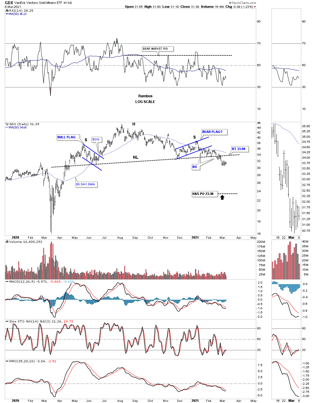
We’ll speed things up now. Below is a daily chart for the GDX which shows its H&S top.
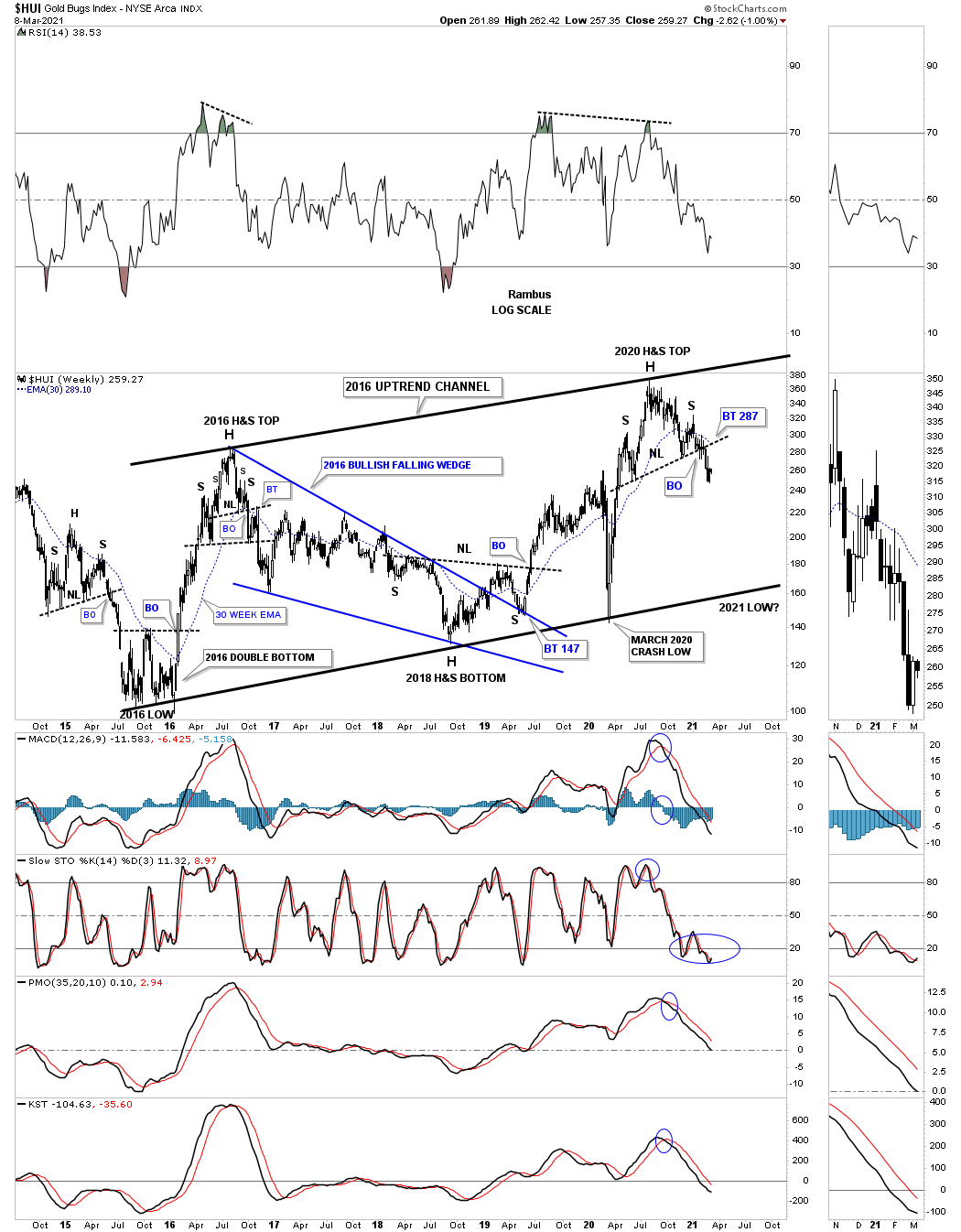
And the HUI.
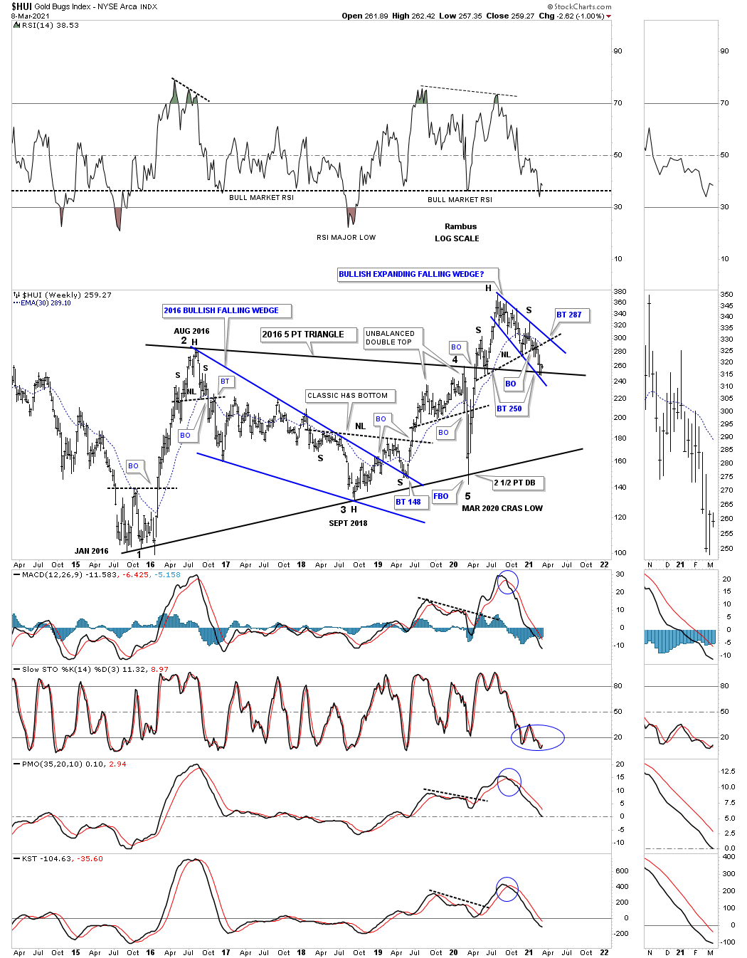
While we are on the HUI lets look at a very long term monthly chart which shows you the critical inflection point this PM stock index is currently at. Ever since the initial breakout back in 2020 I always said I thought we would see a backtest to the top rail of most of those 2016 trading ranges. Well the HUI is now there and is getting a little bounce which is what we should expect even if that top rail eventually fails.
This next chart for the HUI is a 7 year weekly look which shows the internal structure of the 2016 trading range. This chart also shows the conundrum we currently find ourselves in. As you can see there is a lot going on since the breakout above the top rail back in April of 2020. First we got the breakout and then the backtest to the top rail with everything looking normal. The HUI began to impulse to the upside off the backtest with no recognizable problems. After the HUI stalled out it began to consolidate that previous impulse move but has taken its sweet ole time trying to find a bottom with the most logical low now being the top rail of the 2016 trading range at the 250 area.
Now the conundrum which has the H&S top we looked at on the daily charts above which has a price objective way below the top rail of the 2016 trading range. I can’t rule out the possibility that the HUI could rally all the way back up to where the neckline and the top rail of the blue expanding falling wedge intersect around the 287 area. If the HUI can break through that combo resistance point that would be bullish.
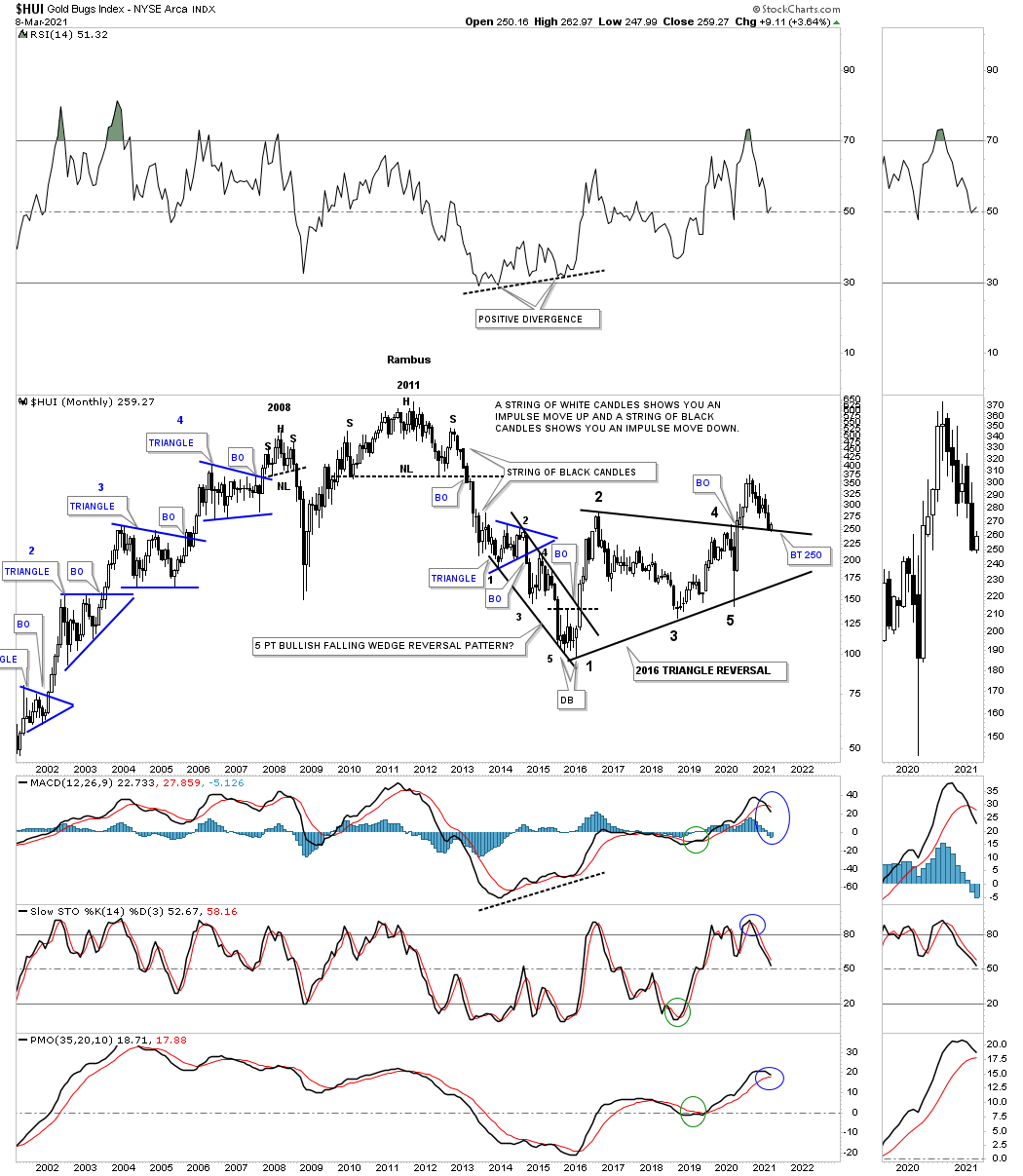
Now I would like to show you a completely different scenario that I haven’t shown you before because it has only become possible since the neckline gave way. I have mentioned countless times in the past that most of the time when you have a big consolidation pattern you will generally see a reversal pattern at the reversal points which stands to reason. Below is a 7 year weekly chart for the HUI which shows you all the chart patterns that have formed over that period of time.
First and foremost it is important to look at each reversal point in that 2016 trading range. If you were a Rambus member back then you should recall those reversal patterns that formed at the reversal points. Note the 2016 double bottom that ended the bear market and launched one of the strongest impulse moves of all times until it ended at the August 2016 high which produced that H&S top. I didn’t want to believe at the time nor anyone else but it was right there staring us in the face and I had to end the party. There was no way to know back then how deep or how long the decline would last but it was a H&S top reversal pattern and until we saw another reversal pattern form from a new low it was what it was whether we liked it or not.
If you think our current correction is unbearable you should have been with us during the nearly 3 years it took to build out that 2016 bullish falling wedge. Luckily we were able to sidestep that nearly 3 year decline and traded the US stock markets. They say there is always a bull market somewhere if you know where to look.
We finally got our reversal pattern in 2018 which turned out to be a pretty large H&S bottom which I called a classic H&S bottom. A classic H&S bottom forms when the left shoulder and head form inside of a falling wedge with the right shoulder low forming on the backtest to the top rail of the falling wedge. You can see a strong impulse began from the right shoulder low and again all looked right with the world. You can see the chopping action that occurred in 2019 that looked like it was going to be a consolidation pattern of some kind but that wasn’t to be the case. About that time came the infamous Coronavirus crash that lasted until the March 23rd low. Luckily we were able to spot the V shaped recovery which showed the small H&S bottom you saw on the daily chart for the GDXJ.
I think you can now see the new picture that has formed for the HUI. Again, note the other H&S reversal patterns that this 7 year chart shows with one double bottom reversal pattern in 2016. Until the 2020 H&S top completed there was no way to know what would happen next in regards to the bull market. Now we have a clear understanding of what to expect and how to protect ourselves and our hard earned capital. If the price action can trade above the neckline and then the right shoulder high the H&S top will be negated and we can then jump in with both feet feeling much more confident about the move. Until then its all about preservation of capital.
This last chart for tonight is the History Chart for the HUI which shows all of its chart patterns since its inception. The weekly chart above starts at the 2016 double bottom on this long term monthly chart. You can see from the longer term perspective how those H&S reversal patterns fit into the uptrend in blue. Should our current 2020 H&S top be any different from the other H&S tops that have formed during the history of the HUI? Note the fairly small H&S top that formed back in 2008 which nobody and I mean nobody wanted to believe was even possible because the bull market was rocking and rolling and life was good if you were a goldbug. The impulse move down only lasted less that 4 months but price wise it was devastating to anyone who was left holding their PM stocks. Some of you may even remember that crash that seemed like it came out of nowhere but that H&S top had been building out for several months and was recognizable.Then there was the 2011 massive H&S top that was as plain as the nose on your face but most goldbugs didn’t want to believe that one either. What about the 2016 H&S top that no one wanted to believe because the party was still going strong when it finally materialized? What about the 2020 H&S top? How will it fit into the big picture when we look back in hindsight? All questions that will eventually be answered. All the best…Rambus


